To avoid panic, understand numbers.
As we hunker down for the foreseeable future, many Americans are using their newly found free time to scour the world for news of Covid-19. As a story, the pandemic has many prongs, but most of them, at least outside the immediacy and tragedy of struggling patients and medical workers, are embedded with data. The ubiquitous Johns Hopkins heat map, which tracks cases across the globe, is just one example.
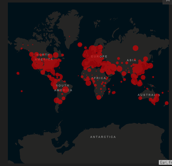
This dashboard is an incredible source of information. It allows users to follow the numbers of cases and deaths across the globe, between nations, and within nations. Americans, for example, can see the data reported for each U.S. State. You can even track the reported number of people recovered in places like China and South Korea.
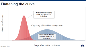
Even the competing curves, which are now part of our daily jargon, are built on data projections. Whether we flatten the curve or suffer the spike, these projections are forecasting outcomes based on a few key choices, like social distancing.
Numbers are also part of the debate about the true challenge of the Coronavirus, especially in comparison to the seasonal flu. People are arguing about mortality rates (0.1% vs. 1%), especially whether that difference justifies radical steps like lockdowns and business closures.
Much of the reporting, as well as the reactions to the reporting, reveals uncomfortable levels of innumeracy. Most Americans, including media members and politicians, have no real grasp of data collection, measurement, or analysis. This is not much of a surprise to people who use numbers regularly. Here are a few key principles to keep in mind as you consume information over the next days, weeks, and months.
First, raw numbers are almost useless. As I write now, Ohio has 704 reported “cases” (cases are a problematic measurement, which I will get to in a moment) of the Coronavirus and 11 deaths attributed to it. In terms of cases, Ohio is nestled between Wisconsin (638) and Connecticut (875). Ohio is 16th out of the fifty American states, at least according to the total number of cases, which must mean Ohio is worse off than most other American states. Right? No, not at all. These numbers need to be put in context by examining the RATE of contamination in light of state populations. Let’s look at a few states using contamination rates.
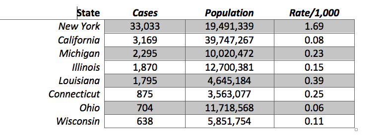
These states are initially sorted by the total number of cases, with New York at the top of this list and Wisconsin at the bottom. Using this crude measurement, New York’s case numbers are still eye-popping, with ten times the cases of the next state on the list. But even this is misleading. The situation in New York is far worse. California’s total number of cases (3,169) are within a population that is nearly double New York’s. Once we take this into account, by dividing the number of cases by the population, and multiplying that result by 1,000 (to yield a rate of contamination per 1,000 people in the state), New York’s situation is TWENTY times worse than California’s. While 1.69 people/1,000 in New York have tested positive, only 0.08/1,000 people in California have.
I have not calculated these rates for all fifty states (though I am sure others have), but even within these numbers, Ohio’s accomplishment, seemingly due to Gov. DeWine’s strong leadership, is remarkable. While it is between Connecticut and Wisconsin in the total number of cases, it is in a much better situation than either state. Based on the number of positive results, Connecticut has four times the rate, while Wisconsin has almost twice the amount. Illinois and Michigan are closer to Ohio in terms of population, and they are, like Wisconsin, in the same region. Ohio not only has fewer cases, but a much lower rate than either of these Midwestern colleagues.
Besides New York, the shocking data point in this little table is Louisiana. For a state with an average population size (25th among the 50 states), it has a high number of positive cases (9th out of 50) and, I imagine, one of the higher rates in the nation. This is one reason why people are predicting New Orleans is the next hotspot after New York City.
All of this assumes, of course, that a variable like “cases” reflects something meaningful. The second principle is that variables must be operationalized. While the term “cases” makes sense, these numbers do not come close to reflecting reality. Since the United States has not been able to make testing widely available across the population, this term really means “positive tests.” There are almost certainly tens of thousands, if not hundreds of thousands, or millions, of “cases” of Covid-19 in the United States that are neither diagnosed nor confirmed. In this sense, we do not have a clear handle on how widely spread the Coronavirus really is. This is one reason why epidemiologists are saying they need to randomly sample a population to determine how widespread the infection actually is.
Even counting Coronavirus deaths is not necessarily straightforward. In order to assign a death to the virus, a test must take place. At least in Ohio, and I am sure in other places, there are not always enough tests, or enough personnel available, to determine the presence or absence of the virus. Some Coronavirus deaths have not been counted, which means the total number of Covid-19 deaths is likely under-reported.
Even when the virus is found, and the death is tabulated, this can be misleading. Someone gravely ill may have died of a variety of causes, including the virus. Others have no obvious pre-existing health conditions, which means the virus is the only proximate cause of death. Both of those deaths are counted the same even though they present different profiles. There is at least the chance that Coronavirus deaths are sometimes over-counted when other factors mattered more–although this is heavily subjective.
Third, be skeptical of comparisons across nations and regions of the world. Whether you are studying religion, politics, or even viral spreads, comparisons between the United States, Italy, China, Spain, France, or any other country can be misleading for several reasons. If raw numbers are used (total number of cases or deaths in Italy and United States), consider populations and rates, just as discussed above. China has more than four times the population of the United States, which has more than five times the population of Italy.
Even when population is considered, countries, and regions within countries, vary tremendously. Italy has not only a smaller population, but it is six times more dense (201/sq. km) than the United States (35 people/sq. km). Density, it seems, would be an obvious factor when you consider the spread of a contagion. Italy also has different social customs and travel patterns, which make comparisons imperfect. A culture that is “touchy,” expressive, and communal would be far more susceptible to Covid-19 than one that is formal, withdrawn, and individualistic.
Such comparisons also don’t take into account how different governments have reacted to the crisis as it emerged. China waited to report and lockdown. The United States also waited for a bit. South Korea was able rapidly to test large portions of its population, while the U.S. was not. The same is true when you compare states here in the U.S. Ohio was aggressive in closing down schools and public meetings, while Louisiana was not. These things may explain the differences, but that also means the comparisons themselves are not always useful.
In social science, we often try to compare cases that are either extremely alike or extremely different. This allows researchers to focus on the differences (while controlling for similarities in “like” cases), or to measure the extremes of a continuum, by examining dissimilar cases. Many of the comparisons we are seeing right now are more dissimilar than similar. That means we may know far less about how the United States fares against the Coronavirus by looking at other nations. Better comparisons may be between similar urban or rural areas, but even those are imperfect.
Fourth, and finally, for now, be careful with trend lines that seek to predict future numbers and patterns. Those lines often build on existing data (like cases or deaths) and project later outcomes by assuming consistency between the past and present. These projections are questionable because they cannot estimate the impact of changes and decisions being made in the recent past, present, or future. Of course, models can factor in those decisions by looking at other cases (nations, regions, states, or cities) where those choices were made, but those comparisons often suffer because of the factors noted above.
What do we do with all of this? Be skeptical of numbers. Think through what is being reported and what it means. Media outlets might use numbers to sensationalize the news. Politicians can use the numbers to justify their behavior. Poke and prod claims to see if they hold up to reason. Be a source of wisdom for friends and family members who might be confused about what all this means.
More than anything, listen to public health experts. Not only do they understand how numbers work, but they can interpret them with the proper nuance and subtlety that comes with real expertise. Politicians are not experts. Reporters are not experts. Many lessons will be drawn from this pandemic. I hope and pray that one of them will be the value of real expertise. Experts aren’t always right, but they can make educated decisions and recommendations built on years, or decades, of study.
 Bert Wheeler
 Jeff Haymond
 Marc Clauson
 Mark Caleb Smith
 Tom Mach